
Scientific Computing#
Python is a powerful tool for scientific computing because it has a wide variety of libraries developed by the research community, students, and organizations. Think of it as an ecosystem where various libraries compete for your attention, each aiming to meet your needs. While multiple libraries may solve similar problems, the Python community has settled on a few core packages that are commonly used.
In this section, we will explore three key libraries:
Numpy for numerical computing
Pandas for handling tabular data
Matplotlib for creating visualizations
Numpy#
Before we begin, let’s pause for a second and try to think about which kind of data types and data structures structures we have learned about so far. Which ones can you remember? Do you think this is already enough for any kind of task you might want to achieve?
Solution
Python includes well known data types such as:
Integer numbers: 1,2,3, …
Floating point numbers: 1.2, 3.14, …
Strings: “Hello”
Boolean values: True/False
Empty value: None
The most important built-in data strucutures are:
Lists: [item1, item2, …]
Tuples: (item1, item2, …)
Dictionaries: {“key”: value(s)}
Arrays#
In fields like neuroscience, datasets can be large and often have more than two dimensions. For example, think of an fMRI scan composed of individual voxels (cubes) in three-dimensional space. And naturally, if you obtained more than one fMRI scan over time, you might have this as a fourth dimension. In such cases, n-dimensional arrays are a good way of storing and handling your data, as they do so as a single object. In any case, arrays are contiguious, meaning they have no “holes”, and they are homogenous, meaning they only consist of a single data type.
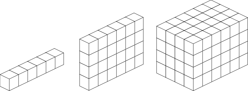
Fig. 4 N-dimensional arrays#
To work with arrays, we will use the NumPy library, which is the most important library for numerical and scientific computing in Python. Recall that by default, the Python namespace only includes a small number of built-in functions. So if we want to use functions that belong to numpy, we need to import it at the top of the script. In principle, you can chose any abbreviation you want (or none at all). However, it usually makes sense to stick to the conventions and import numpy as np.
import numpy as np
The core data structure of numpy are n-dimensional arrays called ndarray. We can create such an array from an existing list as follows:
my_list = [1,2,3,4]
my_array = np.array(my_list)

print(my_array)
[1 2 3 4]
While this might still look like a normal list on the surface, we can look at some additional attributes to see that it is, in fact, a numpy array:
print(f"Variable type: {type(my_array)}")
print(f"Data type:     {my_array.dtype}")
print(f"Data shape:    {my_array.shape}")
Variable type: <class 'numpy.ndarray'>
Data type:     int64
Data shape:    (4,)
You can see that the variable is now a <class 'numpy.ndarray'>. Type int64 means that the data stored in it are 64-bit integers and shape (4,) means that it is a one-dimensional array with 4 items. Similarly, we can create two-dimensional arrays from a list of lists:
list_of_lists = [[1,2,3], [7,8,9]]
my_array = np.array(list_of_lists)
print(my_array)
print(f"Shape: {my_array.shape}")
[[1 2 3]
 [7 8 9]]
Shape: (2, 3)
You can see that we created a two-dimensional array (you could also call it a matrix) of shape (2,3), meaning the array has two rows and three columns.
We can also create a new array from scratch and fill it with a specific value. Often, this is done by initializing an “empty” array containing only zeros:
my_array = np.zeros((4,5))
print(my_array)
print(f"Shape: {my_array.shape}")
[[0. 0. 0. 0. 0.]
 [0. 0. 0. 0. 0.]
 [0. 0. 0. 0. 0.]
 [0. 0. 0. 0. 0.]]
Shape: (4, 5)
However, in cases where 0 is a potential valid input, this can lead to hard to find errors. So an alternative would be to initialize an array filled with np.nan (“not a number”) values. Because if you then add e.g., a single value to it, it is more obvious that the other values are still missing:
my_array = np.full((4,5), np.nan)
my_array[1,2] = 1.0
print(my_array)
print(f"Shape: {my_array.shape}")
[[nan nan nan nan nan]
 [nan nan  1. nan nan]
 [nan nan nan nan nan]
 [nan nan nan nan nan]]
Shape: (4, 5)
Indexing arrays#
We now know how to create arrays. But how can we can data in and out of them? Remember how we previously learned about indexing with lists. Indexing for arrays is fairly similar to this, however we have more flexibility in doing so. Let us first consider a one-dimensional array:
my_array = np.array([1,2,3,4,5])
print(my_array)
print(my_array[0])
print(my_array[3])
print(my_array[-1])
print(my_array[2:4])
print(my_array[:3])
[1 2 3 4 5]
1
4
5
[3 4]
[1 2 3]
We can see that all the indexing operations we pereviously learned about are still valid. my_array[0] gives us the value from the zeroth position, my_array[2] from the second position, and my_array[-1] from the last position. We can also apply slicing operations, whith my_array[2:4] giving us the second and the third position (remember that when slicing, the start is included, but the end is excluded), and my_array[:3] giving us all elements up to the second position.
Similarly, we can also index over two-dimensional arrays by separating the indices whithin the square brackets with commas:
my_array = np.array([[1,2,3],
                    [7,8,9]])
print(my_array)
print(my_array[0,0])
print(my_array[1,2])
print(my_array[:,0])
print(my_array[1,1:])
[[1 2 3]
 [7 8 9]]
1
9
[1 7]
[8 9]
Here, my_array[0,0] gives us the first item in the array, my_array[1,2] gives us the item at position two in the first row, my_array[:,0] gives us the entire first column and my_array[1,1:] gives us all items from the first row starting with the value at index 1.
Important
When indexing two-dimensional arrays, the first dimension always corresponds to the rows, and the second dimension corresponds to the columns!
So e.g. my_array[1,2] would give you the item in row 1, column 2. As a visualization, here are the individual indices for a a 2x3 array:
my_array |
Column 0 |
Column 1 |
Column 2 |
|---|---|---|---|
Row 0 |
my_array[0,0] |
my_array[0,1] |
my_array[0,2] |
Row 1 |
my_array[1,0] |
my_array[1,1] |
my_array[1,2] |
Indexing whith conditionals#
An alternative way of indexing is to use logical oparations. This allows us to chose values from an array, only if they fulfil specific kind of conditions. For example, if we want to get all numbers in an array which are larger than 0, we can use the following expressions:
my_array = np.array([[0,2,0],
                    [0,8,9]])
larger_than_zero = my_array > 0
print(larger_than_zero)
[[False  True False]
 [False  True  True]]
You can see that the result are not yet the values which are larger than zero themselves, but a boolean array which tells us a which positions in the array our condition is Trueor False. We can then use this boolean array for indexing to extract the specific values from the array:
print(my_array[larger_than_zero])
[2 8 9]
This can be useful if you for example want to calculate some statistics over an array. For example, think about an array which holds reaction times measured in one of your experiments, and you want to exclude reaction times of more than one second from your analysis.
Arithmetic with arrays#
Another useful feature of arrays is that you can apply a variety of mathematical operations on them. For example, you can add and substract numbers from all elements in the array, or multiply/divide all elements in the array:
my_array = np.array([[1,2,3],
                     [4,5,6]])
print(my_array + 3)
print(my_array * 2)
[[4 5 6]
 [7 8 9]]
[[ 2  4  6]
 [ 8 10 12]]
Summary
The numpy library is the tool of choice when dealing with n-dimensional arrays in Python.
Pandas#
Many kinds of real-world data are stored in a tabular format. This means two-dimensional tables structured into rows and columns, with each observation typically taking up a row and each column representing a single variable.
The Pandas library is a popular Python library for dealing with tabular data. In comparison to numpy, pandas specifically limits us to two-dimensional tables, but we gain the flexibility of e.g. having variables of different types.
import pandas as pd
DataFrames#
A DataFrame is the core data structure in the Pandas library. It is ideal for working with tabular data, making it easy to manipulate, filter, and analyse data sets. We can create and print a simple example as follows:
my_df = pd.DataFrame({'A': ['A0', 'A1', 'A2', 'A3'],
                      'B': ['B0', 'B1', 'B2', 'B3'],
                      'C': ['C0', 'C1', 'C2', 'C3']})
print(my_df)
    A   B   C
0  A0  B0  C0
1  A1  B1  C1
2  A2  B2  C2
3  A3  B3  C3
We can also read data from other sources such as Excel or CSV (comma-separated values) files. CSV files are a good way of storing tabular data as they are plain text, meaning you can open and read them with any kind of text editor or programming language. Usually, CSV files have a header row containing the labels (column names).
As an example, let us load some data that was collected as part of a study of life span changes in brain tissue properties [YWM14]. We can simply load this file from the internet by using the pd.read_csv() function. The only argument required for this is the data we want to load. In this case, we provide an URL as the data is stored on the internet, however, you would usually provide a path pointing to a file on your computer. All other arguments are optional, but they can be useful in providing additional instructions for what to do with the data. Here, we use usecols=[1,2,3,4,5,6,7] to specify only some specific columns, na_values="NaN" to specify that missing values should be entered as NaN (“not a number”), and index_col=0 to use the first column as an our index:
yeatman_data = pd.read_csv("https://yeatmanlab.github.io/AFQBrowser-demo/data/subjects.csv",
                      usecols=[1,2,3,4,5,6,7],
                      na_values="NaN",
                      index_col=0)
print(yeatman_data.head())
             Age  Gender Handedness     IQ  IQ_Matrix  IQ_Vocab
subjectID
subject_000   20    Male        NaN  139.0       65.0      77.0
subject_001   31    Male        NaN  129.0       58.0      74.0
subject_002   18  Female        NaN  130.0       63.0      70.0
subject_003   28    Male      Right    NaN        NaN       NaN
subject_004   29    Male        NaN    NaN        NaN       NaN
The variable yeatman_data now is a Pandas DataFrame which contains our data and we can use the .head() method to look at the first few rows of the data. The leftmost column subjectID is the index column, while the other columns contain the data for different variables such as age, gender, or IQ. You can also see that the DataFrame is, in contrary to the previously introduced numpy arrays, heterogeneously typed. This means it can contain variables of different types (e.g. strings or floats). You can also already see some missing values. For example, subject003 and subject_004 are missing values for IQ related columns.
Summarizing#
Pandas further contains useful methods to e.g. summarize the data. We can use .info() to get a closer look into our data:
print(yeatman_data.info())
<class 'pandas.core.frame.DataFrame'>
Index: 77 entries, subject_000 to subject_076
Data columns (total 6 columns):
 #   Column      Non-Null Count  Dtype
---  ------      --------------  -----
 0   Age         77 non-null     int64
 1   Gender      76 non-null     object
 2   Handedness  66 non-null     object
 3   IQ          63 non-null     float64
 4   IQ_Matrix   63 non-null     float64
 5   IQ_Vocab    63 non-null     float64
dtypes: float64(3), int64(1), object(2)
memory usage: 4.2+ KB
None
Most of this information should already make sense. An observation that can be made is that Gender and Handedness are stored as objects. This is because they are a mixture of not only strings but also NaNs, which are considered numerical values.
We can also get a first statistical summary for the numerical columns by using the .describe() method. NaN values are ignored for these calculations, but the count column will tell you how many values were used for the calculations in each column.
print(yeatman_data.describe())
             Age          IQ  IQ_Matrix   IQ_Vocab
count  77.000000   63.000000  63.000000  63.000000
mean   18.961039  122.142857  60.539683  64.015873
std    12.246849   12.717599   7.448372   8.125015
min     6.000000   92.000000  41.000000  36.000000
25%     9.000000  114.000000  57.000000  60.000000
50%    14.000000  122.000000  61.000000  64.000000
75%    28.000000  130.000000  64.500000  70.000000
max    50.000000  151.000000  76.000000  80.000000
Indexing#
In previous sessions we already leearned about indexing and slicing as a way of accessing individual elements of e.g. lists. Pandas DataFrames also support a variety of different indexing and slicing operations. For example, we can use label-based indexing to select rows through the .loc attribute and by indexing in square brackets:
print(yeatman_data.loc["subject_000"])
Age              20
Gender         Male
Handedness      NaN
IQ            139.0
IQ_Matrix      65.0
IQ_Vocab       77.0
Name: subject_000, dtype: object
In the case that we do not know the exact label of the subject but just its index (e.g. we want to access the first subject), we can use the iloc attribute for that purpose:
print(yeatman_data.iloc[0])
Age              20
Gender         Male
Handedness      NaN
IQ            139.0
IQ_Matrix      65.0
IQ_Vocab       77.0
Name: subject_000, dtype: object
This returns the same information, as instead of looking for subject_000 we are asking for the first row at position 0. You now might ask yourself how we can index a two-dimensional table with just one index. The answer is that it is just a shorthand form of the full expression:
print(yeatman_data.iloc[0, :])
Age              20
Gender         Male
Handedness      NaN
IQ            139.0
IQ_Matrix      65.0
IQ_Vocab       77.0
Name: subject_000, dtype: object
Remember from previous sections that : stands for “all values”. This means we can also apply slicing to extract a subset of columns:
print(yeatman_data.iloc[0, 2:5])
Handedness      NaN
IQ            139.0
IQ_Matrix      65.0
Name: subject_000, dtype: object
Similarly, we can also access a single column:
print(yeatman_data.iloc[:, 0])
subjectID
subject_000    20
subject_001    31
subject_002    18
subject_003    28
subject_004    29
               ..
subject_072    40
subject_073    50
subject_074    40
subject_075    17
subject_076    17
Name: Age, Length: 77, dtype: int64
However, while .loc and .iloc are powerful attibutes, we can also simply address columns directly by their name:
print(yeatman_data["Age"])
subjectID
subject_000    20
subject_001    31
subject_002    18
subject_003    28
subject_004    29
               ..
subject_072    40
subject_073    50
subject_074    40
subject_075    17
subject_076    17
Name: Age, Length: 77, dtype: int64
If we assign this column to a new variable, it will result in a Pandas Series, which is a one dimensional series of values. Series are pretty similar to DataFrames (essentially DataFrames are just a collection of Series):
age = yeatman_data["Age"]
print(age['subject_072'])
print(age.iloc[72])
40
40
Series are useful as we can, for example, create a new subset of a DataFrame containing only the variables Age and IQ. This can be done by indexing with a list of columns and assigning the resulting subset to a new variable:
yeatman_subset = yeatman_data[["Age", "IQ"]]
print(yeatman_subset.head())
             Age     IQ
subjectID
subject_000   20  139.0
subject_001   31  129.0
subject_002   18  130.0
subject_003   28    NaN
subject_004   29    NaN
Errors#
I would like to emphazize on a few patterns of errors that are unique to Pandas and which you most likely will encounter at some point in your own projects.
One common pattern of errors comes from a confusion between Series and DataFame objects. And while we previously learned that they are indeed pretty similar, they still have some differences. For example, Series objects have a useful .value_counts() method that creates a table with the number of observations in the Series for every unique value. DataFrames however do not implement this method and will cause a Python AttributeErrorinstead.
Another common error comes from the fact that many operations create a new DataFrame as an output insted of changing the current one in place. For example you might expect that:
yeatman_data.dropna()
print(yeatman_data.head())
             Age  Gender Handedness     IQ  IQ_Matrix  IQ_Vocab
subjectID
subject_000   20    Male        NaN  139.0       65.0      77.0
subject_001   31    Male        NaN  129.0       58.0      74.0
subject_002   18  Female        NaN  130.0       63.0      70.0
subject_003   28    Male      Right    NaN        NaN       NaN
subject_004   29    Male        NaN    NaN        NaN       NaN
will remove the NaN values from the DataFrame. However, it will not do so on the yeatman_data DataFrame itself but you need to assign it to a new variable if you want to keep this result:
yeatman_without_nan = yeatman_data.dropna()
print(yeatman_without_nan.head())
             Age  Gender Handedness     IQ  IQ_Matrix  IQ_Vocab
subjectID
subject_007   34    Male      Right  115.0       66.0      51.0
subject_009   21    Male      Right  124.0       63.0      64.0
subject_010   29  Female      Right  130.0       60.0      73.0
subject_011   31    Male      Right  128.0       64.0      67.0
subject_012   28  Female       Left  129.0       68.0      64.0
or alternatively, explicitly specify that the existing yeatman DataFrame should be modified:
yeatman_data.dropna(inplace=True)
These kind of errors are especially dangerous, as you could unknowingly continue working with an unchanged DataFrame, leading to erroneous results later on in your script. It therefore makes sense to at least periodically check the intermediate results in your calculations to spot errors early.
Finally, indexing errors are also common. Don’t be discouraged by such errors, as indexing can indeed be confusing in the beginning, especially with different ways of doing so such as indexing in NumPy, indexing by rows and columns, and indexing with .loc or .iloc.
Matplotlib#
A picture is worth a thousand words, and this holds especially true when working with complex data. Data, on its own, cannot tell its story, but through visualization, we can bring clarity to its patterns and insights. Effective data visualization is a critical part of the research process, allowing researchers to communicate findings clearly. Being a good researcher, therefore, also means being able to create compelling visual representations that make complex information accessible and understandable.
There are a few different Python software packages that help you with visualizing data, for example matplotlib, seaborn, or plotly. Please feel free to explore the examples on the websites to see what is possible with these libraries. For now, we will start with matplotlib, as it is probably the most widely used package out there (and also builds the foundation for e.g. seaborn).
Matplotlib is a powerful library with several different interfaces. The one you should almost always use is the pyplot module, which you can import with any of the two following two lines of code:
from matplotlib import pyplot as plt
import matplotlib.pyplot as plt
Both ways of importing sub-modules from a library are equivalent and you will encounter both of them in the wild. Then, in its simplest form, we can create a plot by calling the plt.subplots() function:
fig, ax = plt.subplots()
You can see that you have created an empty plot. In its simplest form, the subplots function is called with no arguments, returning two objects: a Figure container for Axes (fig) and an Axes canvas for data (ax). The Figure acts as the overall page, holding and organizing multiple Axes objects, while the Axes is where the data is plotted.
Line plots#
To add data, we use methods of the ax object. For example, let’s plot data from Harry Harlow’s 1949 experiments [Har49], where animals chose between two options, one rewarded with a treat. Below are the results from three blocks of trials: the first, mid-experiment, and the last block.
trial = [1, 2, 3, 4, 5, 6]
first_block = [50, 51.7, 58.8, 68.8, 71.9, 77.9]
middle_block = [50, 78.8, 83, 84.2, 90.1, 92.7]
last_block = [50, 96.9, 97.8, 98.1, 98.8, 98.7]
As shown in the numbers, performance on the first trial of each block averaged 50%, since the animals had no prior knowledge of which option would be rewarded. After the initial trial, learning began, and their performance gradually improved. In the first block, improvement was slow and challenging, while in the final block, the animals showed rapid improvement. The middle blocks showed moderate progress, neither as slow as the first block nor as fast as the last. Harlow suggested this reflected the animals’ ability to “learn to learn” by understanding the task’s context—introducing the concept of a learning set. While this description provides some insight, a visual representation is far more revealing. Let’s recreate the graph from Harlow’s classic paper using the ax.plot method:
fig, ax = plt.subplots()
ax.plot(trial, first_block)
plt.show()
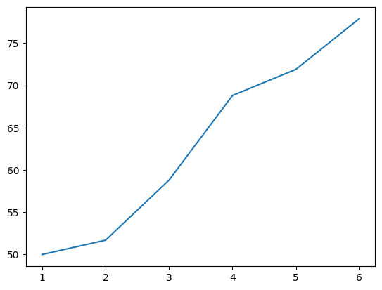
Calling ax.plot adds a line to the plot. The horizontal axis (x-axis) represents the trials within the block, while the vertical axis (y-axis) shows the average percent of correct responses for each trial. This line visualizes the gradual learning that occurs over the first set of trials.
If you’d like to include more data, such as additional trial blocks, you can simply add more lines to the plot. Let’s now see how we can add data for the other blocks to compare performance across them:
fig, ax = plt.subplots()

ax.plot(trial, first_block)
ax.plot(trial, middle_block)
ax.plot(trial, last_block)

plt.show()
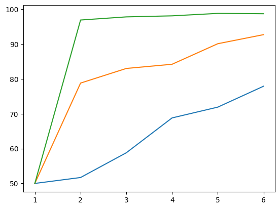
With multiple lines, it quickyl becomes hard do distinguish them. We can improve this by simply adding a legend, labels, and a title:
fig, ax = plt.subplots()

ax.plot(trial, first_block, label="First block")
ax.plot(trial, middle_block, label="Middle block")
ax.plot(trial, last_block, label="Last block")

ax.legend()
ax.set(xlabel='Trials', ylabel='Percent correct', title='Harlow learning experiment')

plt.show()
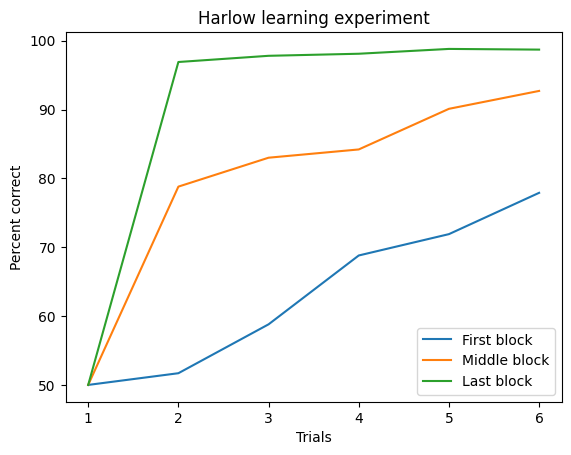
Before we’re done, there’s still some customization to improve the clarity of the plot. Right now, the data appears continuous, which is misleading since measurements were only taken at specific trials. We can fix this by adding markers to indicate where the measurements occurred. Each variable can have a different marker, added as keyword arguments in the plot call. We’ll also set linestyle='--' for a dashed line to better reflect the discrete nature of the data:
fig, ax = plt.subplots()

ax.plot(trial, first_block, marker='o', linestyle='--', label="First block")
ax.plot(trial, middle_block, marker='v', linestyle='--', label="Middle block")
ax.plot(trial, last_block, marker='^', linestyle='--', label="Last block")

ax.legend()
ax.set(xlabel='Trials', ylabel='Percent correct', title='Harlow learning experiment')

plt.show()
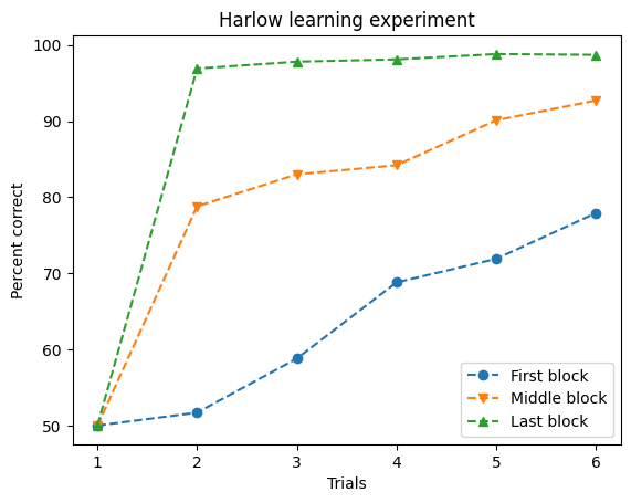
So what if you want so show more than one plot? Even though the previous plot is not too complicated, for the sake of simplicity let us assume that we want to split each set of trials into a different subplot. We can do so by simply specifying the number of plots arguments to the plt.subplots function and then indexing the ax object:
fig, ax = plt.subplots(1, 3, figsize=(10,4))

blocks = [first_block, middle_block, last_block]
labels = ["First block", "Middle block", "Last block"]
markers = ['o', 'v', '^']

for i in range(len(blocks)):
    ax[i].plot(trial, blocks[i], marker=markers[i], linestyle='--', label=labels[i])
    ax[i].set(xlabel='Trials', ylabel='Percent correct', title=f'{labels[i]}')

plt.tight_layout()
plt.show()
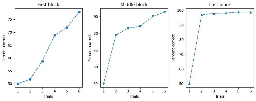
Hint: plt.tight_layout tries to automatically adjusts subplot parameters to minimize overlap and ensure that all elements, like labels and titles, fit within the figure boundaries.
Scatter plots#
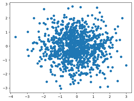
A scatter plot displays data points where each marker’s position on the x-axis represents a value from one variable, and its position on the y-axis represents a value from another variable. This type of plot allows us to directly compare these two variables and observe overall patterns or trends. For example
import numpy as np

# Draw 1000 random values from a standard normal distribution
x = np.random.randn(1000)
y = np.random.randn(1000)

fig, ax = plt.subplots()
ax.scatter(x,y)
plt.show()
Bar plots#
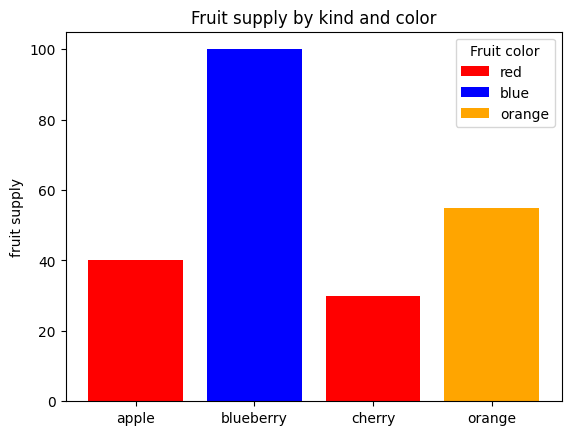
A scatter plot displays data points where each marker’s position on the x-axis represents a value from one variable, and its position on the y-axis represents a value from another variable. This type of plot allows us to directly compare these two variables and observe overall patterns or trends. For example
fig, ax = plt.subplots()

fruits = ['apple', 'blueberry', 'cherry', 'orange']
counts = [40, 100, 30, 55]
bar_labels = ['red', 'blue', '_red', 'orange'] # _red makes this a hidden label (so red only appears once)
bar_colors = ['red', 'blue', 'red', 'orange']

ax.bar(fruits, counts, label=bar_labels, color=bar_colors)
ax.legend(title='Fruit color')
ax.set(ylabel='fruit supply', title='Fruit supply by kind and color')

plt.show()
Additional information:#
If you look for plots on the internet, you will sometimes also see figures created with plt.figure():
plt.figure()
plt.bar(fruits, counts, label=bar_labels, color=bar_colors)
plt.legend(title='Fruit color')
plt.ylabel('fruit supply')
plt.title('Fruit supply by kind and color')
plt.show()
This is mostly used when you only require a quick and single plot. As it generally offers less flexibility, I would recommend you to use the standard plt.subplots() syntax as introduced in this section.
As previously mentioned, the matplotlib library also offers many other ways of visualizing data. If you explore the examples, you will most likely find a plot similar to the one you need.
Statistical visualizations#
Statistical visualizations help us draw inferences from data or make comparisons between datasets. For this, we’ll use the Seaborn library, which combines the power of Pandas with the flexibility of Matplotlib. To demonstrate statistical visualizations, let’s look at the table of subject properties from the Pandas chapter:
import pandas as pd
import seaborn as sns

yeatman_data = pd.read_csv("https://yeatmanlab.github.io/AFQBrowser-demo/data/subjects.csv",
                      usecols=[1,2,3,4,5,6,7],
                      na_values="NaN",
                      index_col=0)
print(yeatman_data.head())
             Age  Gender Handedness     IQ  IQ_Matrix  IQ_Vocab
subjectID
subject_000   20    Male        NaN  139.0       65.0      77.0
subject_001   31    Male        NaN  129.0       58.0      74.0
subject_002   18  Female        NaN  130.0       63.0      70.0
subject_003   28    Male      Right    NaN        NaN       NaN
subject_004   29    Male        NaN    NaN        NaN       NaN
First, let’s compare IQ across different handedness and gender using a bar chart. In this chart, the height of each bar represents the average value of a variable (in this case, IQ) for a group of observations. The position of the bars on the x-axis will differentiate right-handed from left-handed individuals, while the bar color (or hue) will distinguish between male-identified and female-identified individuals:
sns.barplot(data=yeatman_data, x="Handedness", y="IQ", hue="Gender")
plt.show()
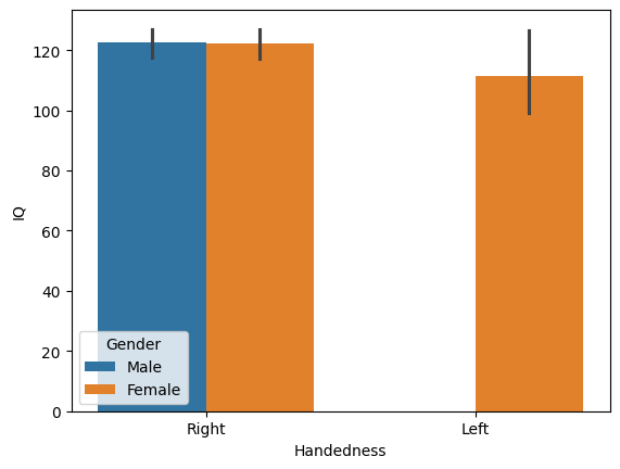
That’s it! Just one line of code. Seaborn automatically uses the Pandas DataFrame to determine how to split the data, label the axes, and create the legend. It also adds error bars to represent the 95% confidence interval using a method called bootstrapping, which resamples the data to estimate variability. In this case, there are no left-handed males, so their bar is absent.
While bar charts are useful—especially when error bars are included to show data variability—they can be misleading if not used carefully. For instance, Anscombe’s quartet demonstrates that different datasets with identical means and variances can produce identical bar charts, even though the underlying data tell very different stories.
Seaborn offers more informative alternatives. For example, you can display each observation within a group using a swarmplot, or visualize the full distribution with a violin plot, which smooths the data into a silhouette shape. These alternatives provide a clearer picture of the data’s underlying patterns:
fig, ax = plt.subplots(1, 2)
sns.swarmplot(data=yeatman_data, x="Handedness", y="IQ", ax=ax[0])
sns.violinplot(data=yeatman_data, x="Handedness", y="IQ", ax=ax[1])

plt.tight_layout()
plt.show()
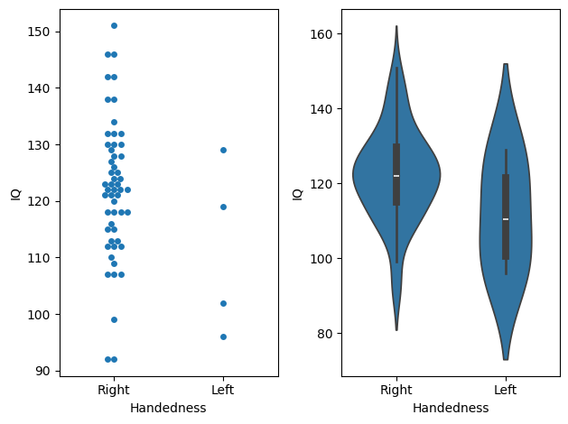
Choosing the right visualization depends on the data. For instance, a swarmplot clearly shows the difference in sample sizes, with more data points for right-handed individuals compared to left-handed ones. However, if the dataset is large, a swarmplot may become overcrowded and hard to interpret, making a violin plot a better choice as it provides a smoother summary of the data distribution. Personal preference also plays a role in selecting visualizations.
Another common option is the boxplot. It displays the median as a vertical line, the quartiles (25th and 75th percentiles) as the bottom and top of a box, and the range as whiskers extending from the box. Outliers—data points far from the quartiles—are shown beyond the whiskers. For example, in the IQ data, a right-handed subject is flagged as an outlier because their score differs from the 25th percentile by more than 1.5 times the interquartile range:
sns.boxplot(data=yeatman_data, x="Handedness", y="IQ")
plt.show()
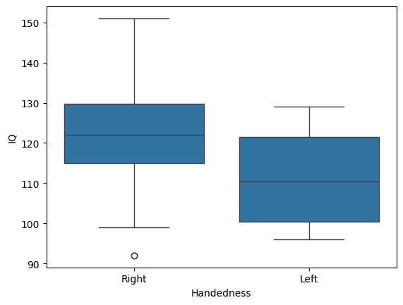
One advantage of the boxplot is that it conveys a lot of information in a simple format, especially to readers familiar with its conventions. However, like the violin plot, it doesn’t show certain details, such as differences in sample size between groups.
Statistical visualizations can also accompany more advanced analyses. For instance, Seaborn’s lmplot function fits a linear model to the data. It displays a scatter plot (e.g., scores from two IQ subtests) along with a linear regression line and a shaded area representing the 95% confidence interval. Additionally, this function can split data by another variable, such as gender, for more detailed insights:
sns.lmplot(data=yeatman_data, x="IQ_Matrix", y="IQ_Vocab", hue="Gender")
plt.show()
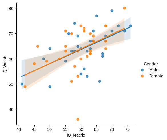
As you can see, one of Seaborn’s strengths is its ability to create visuals that are both aesthetically pleasing and highly informative. For most datasets, Seaborn can generate publication-quality figures that are well-suited for reports or scientific papers. While Seaborn excels at creating polished visuals with minimal effort, Matplotlib’s strength lies in its high level of customizability. For more complex or specialized visualizations, the flexibility of Matplotlib allows for detailed adjustments that Seaborn’s default settings may not easily accommodate. Having both tools at your disposal means you can choose between simplicity and full control, depending on the needs of your analysis.
More plots#
Apart from the matplotlib documentation and the seaborn documentation, the Python graph gallery is a great resource to dive into all kinds of beautiful plots you can do with Python. Have a look around and explore!